
DESIGN FOR SCIENCE
Who We Are and How We Got Here
I enjoy working with scientists. Collaborations that pique my interest combine novel research and popular appeal with the potential for surprising and memorable visuals.
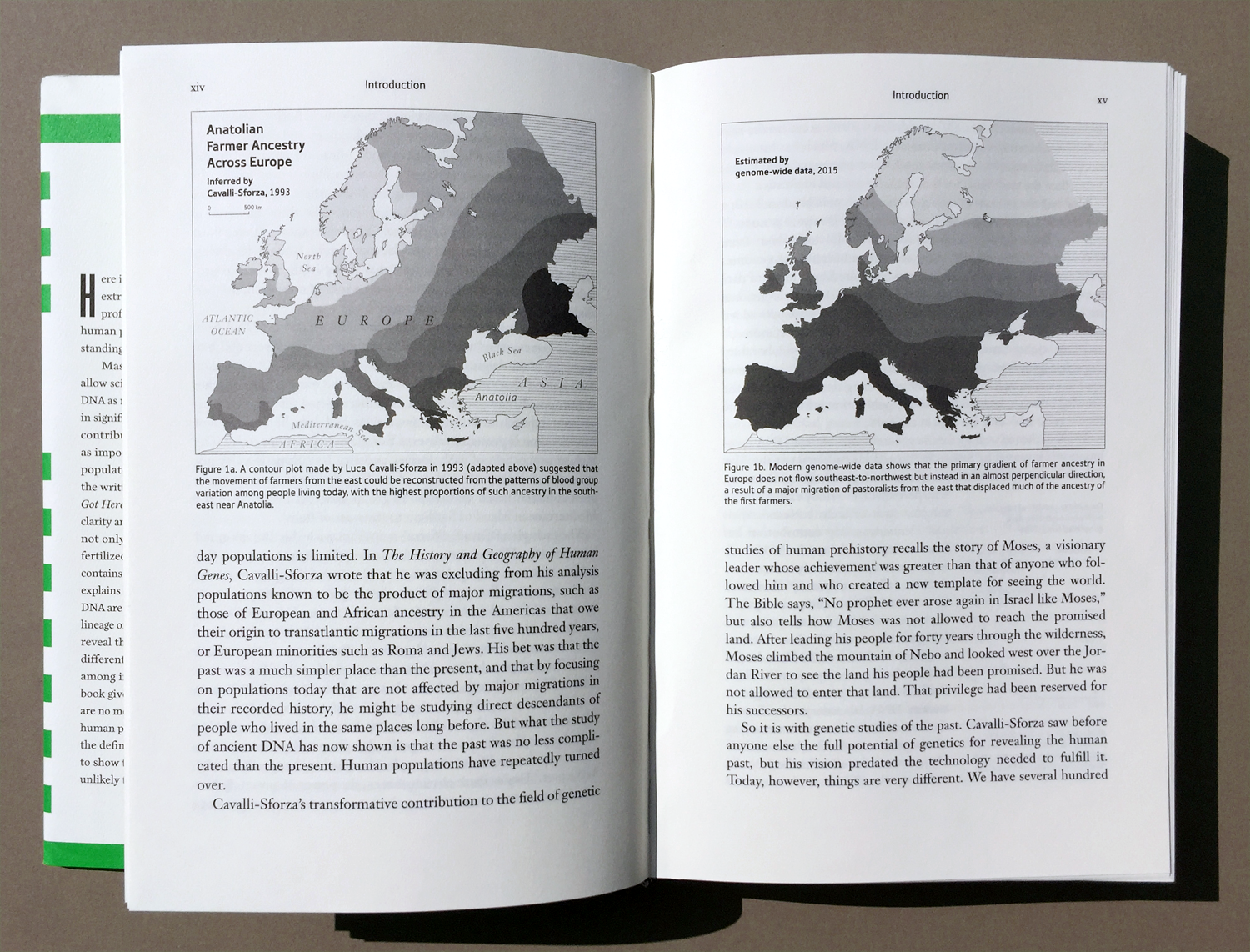
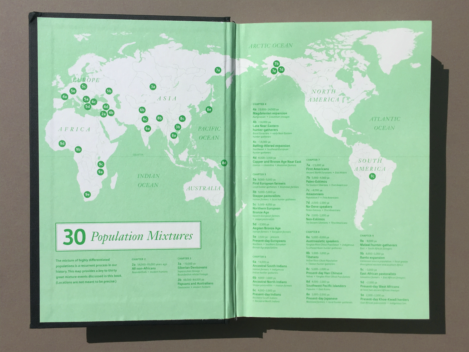
In 2017, geneticist David Reich invited me to create a set of figures for his groundbreaking book, Who We Are and How We Got Here: Ancient DNA and the New Science of the Human Past. Since then, I have helped Reich and other scientists create figures and cover illustrations for their submissions to leading scientific journals.
FROM POWERPOINT TO PUBLISHABLE

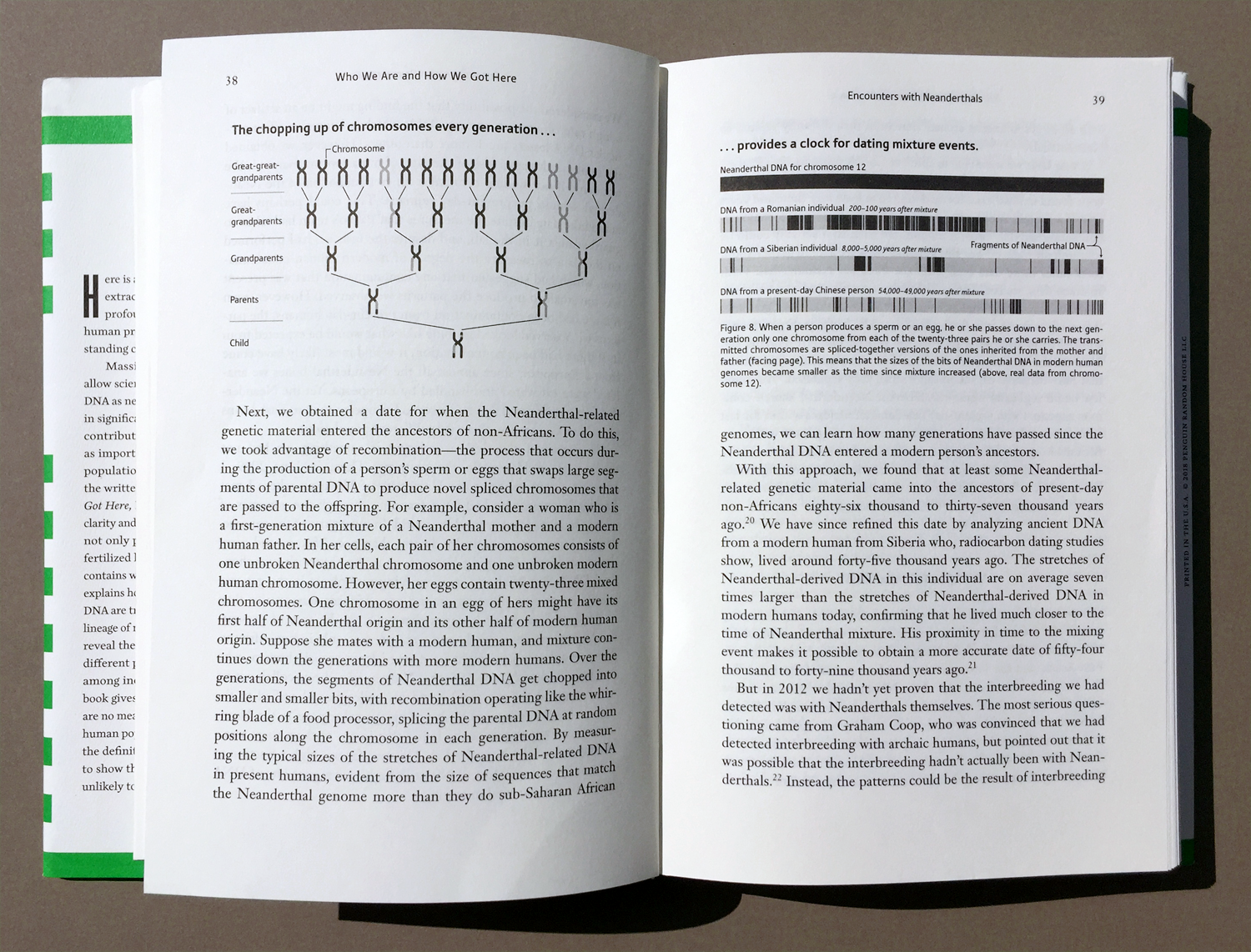
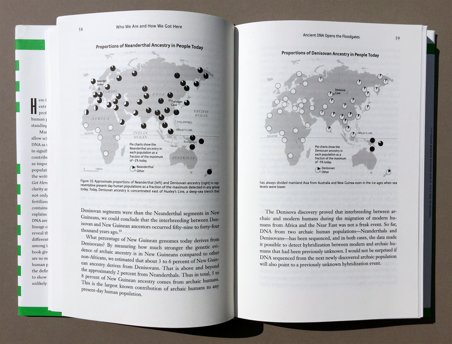
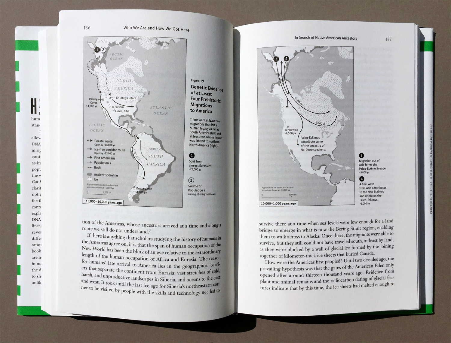
Scientific figures don’t have to be ugly. When I design for scientists, I ask questions until I’ve isolated the ONE message that a reader should grasp from each figure. This could be a route, pattern, trend, process, difference, or distribution. Whatever the message, everything else—every other line, point, shape, color, or label—I try to make secondary. If it’s not helping, it’s hurting.
For example: At the start of my collaboration with David, he sent me a slide featuring an image of cells, chromosomes, and DNA (above, left). The extra labels, realistic shading, and twisting dimensionality muddied its message. What a reader needed to see was that life’s building blocks are a set of nesting parts, so I flattened the anatomy into a step-by-step schematic (above, right).
“Oliver was obsessive about getting every last detail right and making sure that every figure was a masterpiece of scientific communication.”
CLARITY WITHOUt COLORs
This book, like most trade nonfiction, was printed with only black ink. At first, that can seem like a terrible limitation. However, grayscale is actually a helpful test for decluttering figures. Because there are no colors to hide behind, you’re forced to be more aware of what each shade signifies and more selective in what information you include.